
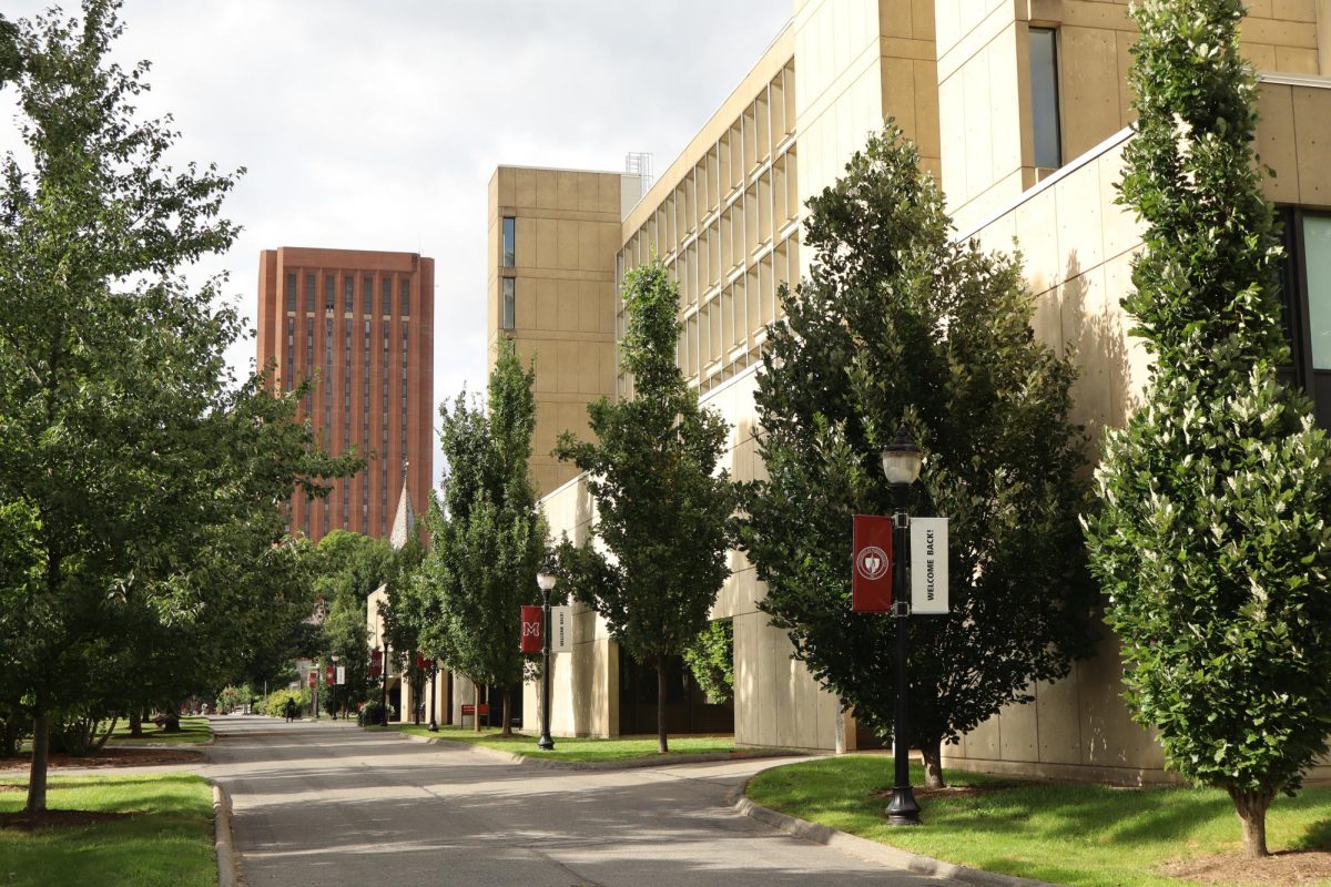
As I look out the window of the ninth floor of the library, I see the dreary fog that spreads over our campus. Whenever I see this sight, a repetitive thought runs through my head. It reminds of when I ask my friends why they didn’t attend UMass when they were accepted at the time. Their responses usually are strikingly similar. “I needed more life in the campus.” “Too much concrete for me.” “I couldn’t get over how ugly the buildings were.” “These buildings with the combination of New England weather do not create an atmosphere that is ideal for learning.”
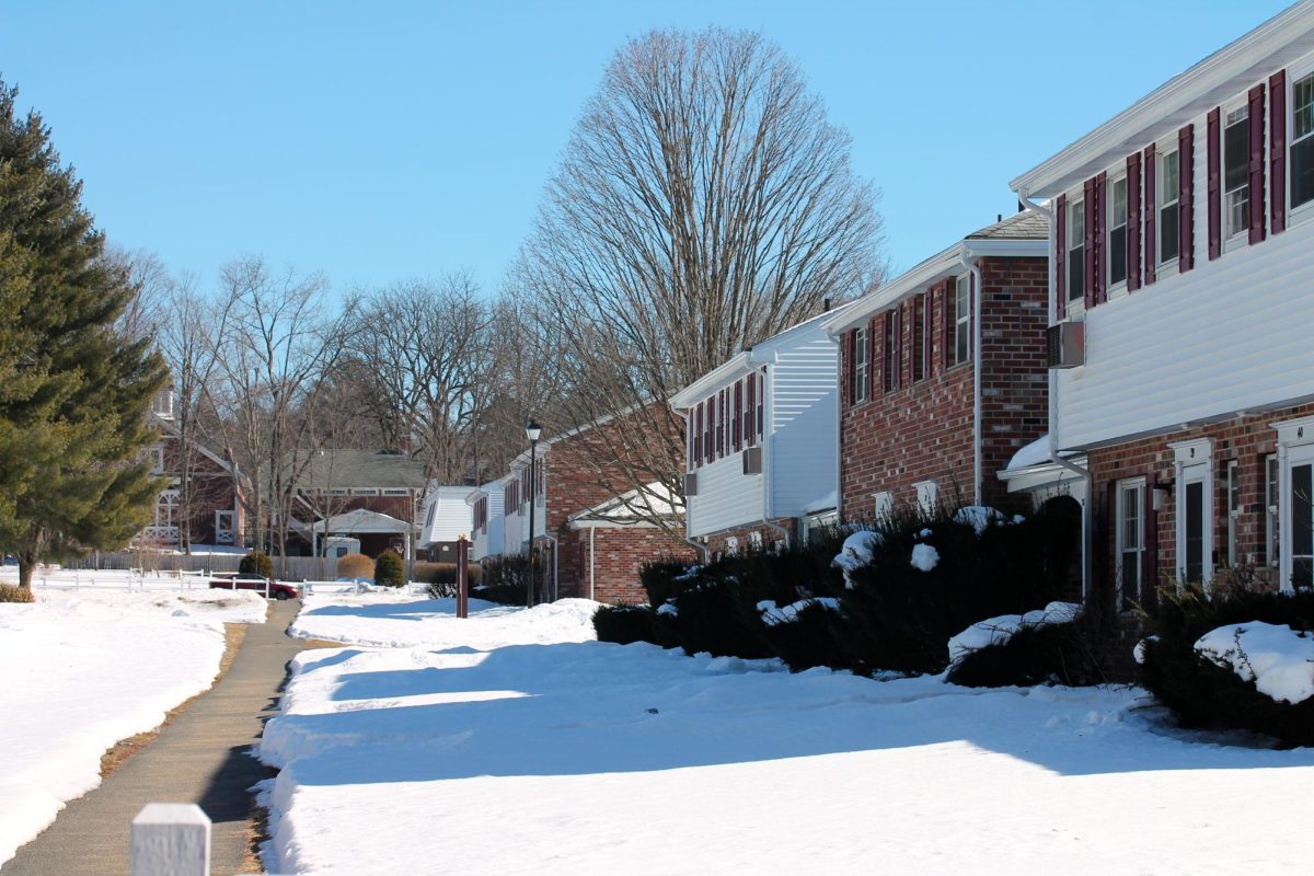
Are you starting to pick up the theme? The UMass campus is notoriously known as one of the most bland, monotonous campuses in the country with no immediate plans of livening up our current buildings. With construction prevalent on all sections of campus, our Master Plan is set to make our campus a more desirable place for students over the course of the next 50 years. Nevertheless, with brand new dormitories opening in the fall of 2013, our Master Plan is missing one piece of vital renovation and that is to fix the exterior of our buildings that resemble Orwellian office parks. The blandness of our campus has not been addressed in the Master Plan. The Master Plan has unbelievable upgrades for our campus which include upgrading the landscape, widening roads for more bike accessibility, enhancing transportation around the campus and even upgrading the interior of buildings. My complaint, however, is that there is no mention of enhancing the exterior of any of the uninspiring buildings that plague our campus.
It’s obvious that the future plan of the university is to attract more students, but in order to attract, just like in the animal kingdom, the bright, colorful and exuberant must be prevalent. As I walk around campus, I do not see dead infrastructures that have no life. What I see is an opportunity for our campus to become unique. In order to be unique, we must be innovative with what we already have. And what we have are blank canvases on buildings just waiting for some kind of artistic expression.
Have you ever thought of how inventive and creative UMass could be if the Campus Hotel had beautiful murals on both of the blank walls that face the campus garage? Even the campus garage has some potential. Instead of having a geometrical beastly garage in the middle of our campus, we could use some innovative ideas to brighten it up. Likewise with Herter Hall. All of these buildings have the opportunity to help this campus become something special. In city revitalization, like the one that is going on in Germantown Avenue located in North Philadelphia, cities commission artists who are given the task of bringing life to neighborhoods that have been abandoned. The artists hired in Philadelphia were Haas and Hahn, a Dutch duo that focuses on mural art. They were assigned the task of revitalizing a neighborhood that has been plagued by old infrastructures, so they went to the streets and started to make friends with the citizens and community of this neighborhood.
The murals are nothing fancy, they’re just vibrant stripe patterns painted with a variety of colors and shades of green, blue, red, pink and orange. These murals have changed the facades of all of the buildings into something that looks like it came out of a Dr. Seuss book. And with the enormous color change, a new sense of community has risen in the once desolate neighborhood. UMass is not an abandoned, underprivileged neighborhood, but its desolate buildings are in need of some life. Instead of UMass administration investing millions of dollars in renovating the football stadium, the administration should start using that money to revitalize old buildings on our own campus. To paint our concrete buildings would be a much easier solution to solve our ugly problem. Not only is it a quick fix, but it could bring our mood up when it’s raining, foggy, cold and windy (these usually occur all on the same day) and even attract more students because of the radiance our campus will show. I believe that to attract more, unique, intelligent and profound students to our growing university, we must make our campus into one that can show prospective students that we can make problems into something beautiful.
However, the true aim of murals is to help with the area’s unity as a whole, something that UMass has been lacking for quite some time now. These murals could be a collective idea that our students could vote and decide on, to create the design scheme that should be used. Students could decide on what the vibe of the campus is, what the experience of UMass is and even help paint our way into becoming unique. These murals have the potential of creating a student body that becomes more of a whole rather than a campus that is divided into dormitory subsections.
The Master Plan needs to have one more update: Color = Unity.
Evan Hutton is a Collegian contributor. He can be reached at [email protected].




anony. • Feb 15, 2013 at 7:21 pm
Not a bad idea, but one thing – painting over corrugated concrete isn’t as easy at it seems, it’s not like painting on any flat surface. the corrugation of the concrete means that you’d have to paint layers upon layers to cover anything – literally, pounds of paint for a relatively small area. this is the problem umass dartmouth faces with their buildings as well, and why they cannot just paint over the dismal grey.
Mrs Parikh • Feb 15, 2013 at 12:23 pm
talk is cheap
mike • Feb 15, 2013 at 8:46 am
The greatest irony is the fine arts centers striking resemblance to pictures of North Korea I’ve seen. Its possibly one of the largest, ugliest buildings I’ve ever seen.
Mike