Editor’s Note: The following column is satirical. It is meant for humorous purposes. All interviews and individuals are fictitious.
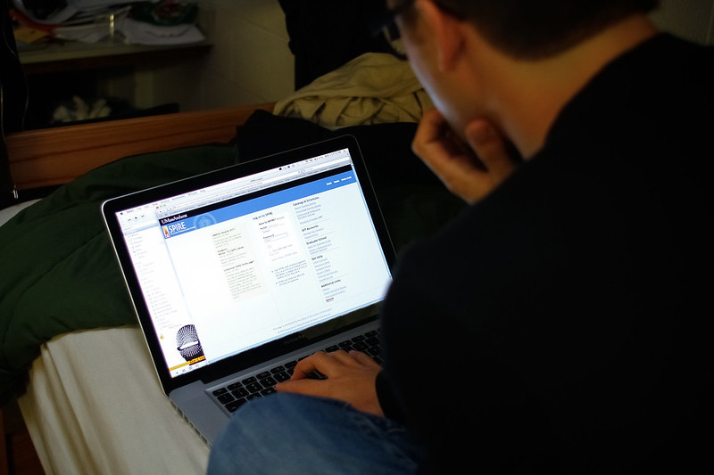
The Spire of yore is no more. Sadly, on Oct. 23, 2022, the Spire we knew and loved was shuffled from its digital coil and replaced with an “updated interface” imposter.
Spire, the crown jewel of the information technology department and the ever-beloved object of my heart, was the online student portal hosting the University of Massachusetts’ digital bureaucracy.
Known for its crippling inability to handle the back arrow and repeated error messages stating “you do not have authorization to access this page,” when trying to view one’s own class schedule, one could always take comfort in Spire’s consistency of letting us down every semester.
Oh, Spire — out, out brief candle! Your sweet interface, which looked like it had been coded in HTML by a high schooler in 2007, never ceased to confuse and disarm me!
I admit that I am sobbing uncontrollably as I write these words. If only Shakespeare were alive today to see this tragedy, he would surely pen yet another philosophical masterpiece in its honor: “Spire is ‘but a walking/shadow, a poor player, / That struts and frets his hour upon the stage, / And then is heard no more. It is a tale / Told by an idiot, full of sound and fury, / Signifying nothing.”
I am literally inconsolable at this point.
But how did this tragic update come to pass?
The Spire saga began late last year when Chancellor Subbaswamy made his yearly descent down to visit the secret catacombs where UMass keeps its IT department. Upon arriving, it is reported that he pondered a dark floating orb for approximately thirty minutes, after which he threw back his cloak in a fervent reverie. He continued to prophesize that the IT department shall forge, “one Spire to rule them all and in the darkness bind them.” With that, he vanished like the fine morning mist, giving no further instruction or explanation.
Assuming that they were divinely ordained to develop a Spire update, the IT department got straight to work. With over $125 million recently donated to the Manning College of Information and Computer Sciences, you can bet that the IT department make fantastic use of that money by using approximately zero dollars.
Furthermore, despite a population of young undergraduates coding up algorithms that solve topological gradients in the tenth dimension before lunch, the IT department still decided to hold true to its programming team – 54-year-old dads who actively use Yahoo! as their search engine of choice.
Like Michelangelo crafting his masterpiece, the IT department spent countless hours painstakingly writing a whopping total of eight lines of code for the homepage.
Prototypes of the interface include the best that graphic design rejects have to offer. Light-colored text on light backgrounds, eight-point Arial font and uncentered widgets were all in theme. Good thing these were just prototypes and never became the actual design of the homepage, right?
As the clock struck midnight on Oct. 23,we all held our breath as the new update unfurled. With unbearable suspense, I typed in my login information. And then I had to re-type all my login credentials and wait for a security code text so I could verify my identity.
Finally, after having to re-type my login for a third time because I messed up the security code by accident, I beheld Spire 2.0.
I was outraged by how the new update failed to live up to the beloved incompetence of the original Spire. With functional tabs and the ability to use the backspace without being logged out, it was a mere mockery of what Spire once was.
Students across campus are still able to find comfort in the new Spire’s familiar objectively poor graphic design. It’s an excellent case study of how turning up the transparency settings on a background stock image of the Old Chapel doesn’t make the text any easier to read. Instead of researching my academic requirements, I will be staring at the three students that got caught in the photo’s middle-ground, forever immortalized by the Spire homepage.
Additionally, students who miss the feelings of despair and ennui experienced after using the original Spire will find comfort in the fact that the new Spire cyberbullies them just as much as the old one.
By displaying one’s student debt (calculated to the nearest cent) in the center of the new homepage, students can grapple with their financial anxiety just as nature intended.
The new Spire, though full of functionality fixes, still holds many silly little surprises that confuse and frustrate me, just like its beloved predecessor. For example, the dropdown menu that lists “Student Center” as the one and only option just makes sense.
The “Home” icon that, upon clicking to return to the homepage, states “you are not authorized for this page” nearly brings a tear to my eye. I had to click on six different sub-tabs just to pull up a calendar view of my class schedule.
Ah, just like old times. Maybe this new Spire is adequately terrible after all.
Kelly McMahan can be reached at [email protected].


